Health · Design system
Confidential
An ecosystem of four web apps that had grown separately, with no shared language, graphic or technical. My mission: give it a coherent, durable and scalable design system.
The problem
Four web apps (portal, reports database, marketing site, back-office) with no shared language, each on its own stack: Vue.js, React, WordPress.
The key decision
Reconcile the profession's own vocabulary with design, usage and accessibility conventions (RGAA, WCAG), rather than imposing one over the other.
What changed
The whole ecosystem rethought: more than 100 components and variants with native light and dark mode, validated in Figma and under study on the development side.
Design systemRGAA accessibilityChange managementAI-assisted design and dev collaboration
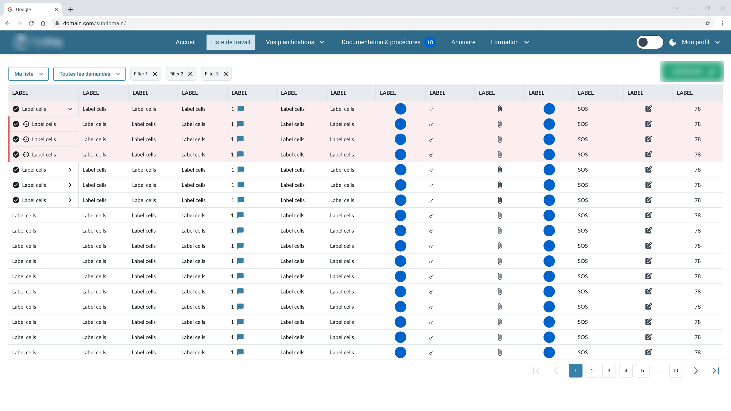
Four products, four languages: each had its own colours, corners and buttons, with no shared rule. The existing product isn't shown.
01 · Context and problem
An ecosystem that had grown in pieces
The platform connects healthcare facilities and remote professionals, on a dense professional journey. The product was made of four web apps that had each evolved on their own (portal, reports database, marketing site, back-office), each also built on its own stack: Vue.js, React, WordPress.
The inconsistency didn't stop at the products' borders either: on the portal alone, several different implementations of the same component already coexisted, with no technical excuse to hide behind.
Users were also asking for a dark mode, for visual comfort. At the request of the head of the company, the whole ecosystem had to be rethought and given a coherent, durable system, while evangelising UX/UI among the business teams.
Reconcile the profession and the conventions.
(the key decision)
02 · Approach
Scope with the people who build
- Scoping workshops with the DevOps and development teams.
- Audit and rationalisation of the existing product, across all four products.
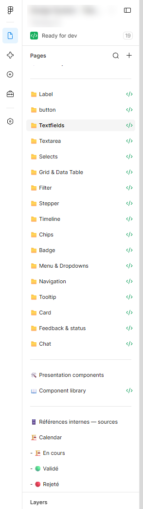
- Arbitration on components: for the same component (textfields, cards...), several technical implementations coexisted, even within a single product. With no shared library on the development side, the system was rebuilt screen by screen to spot every divergence before settling it.
- Pair design with the DevOps team, for a double reading, human and AI, with business principles brought into the design conventions rather than erased in favour of a generic convention.
- Also a lever to propose the redesign of some UX/UI journeys as components were reworked.
03 · Solution
Three colour layers, one business rule
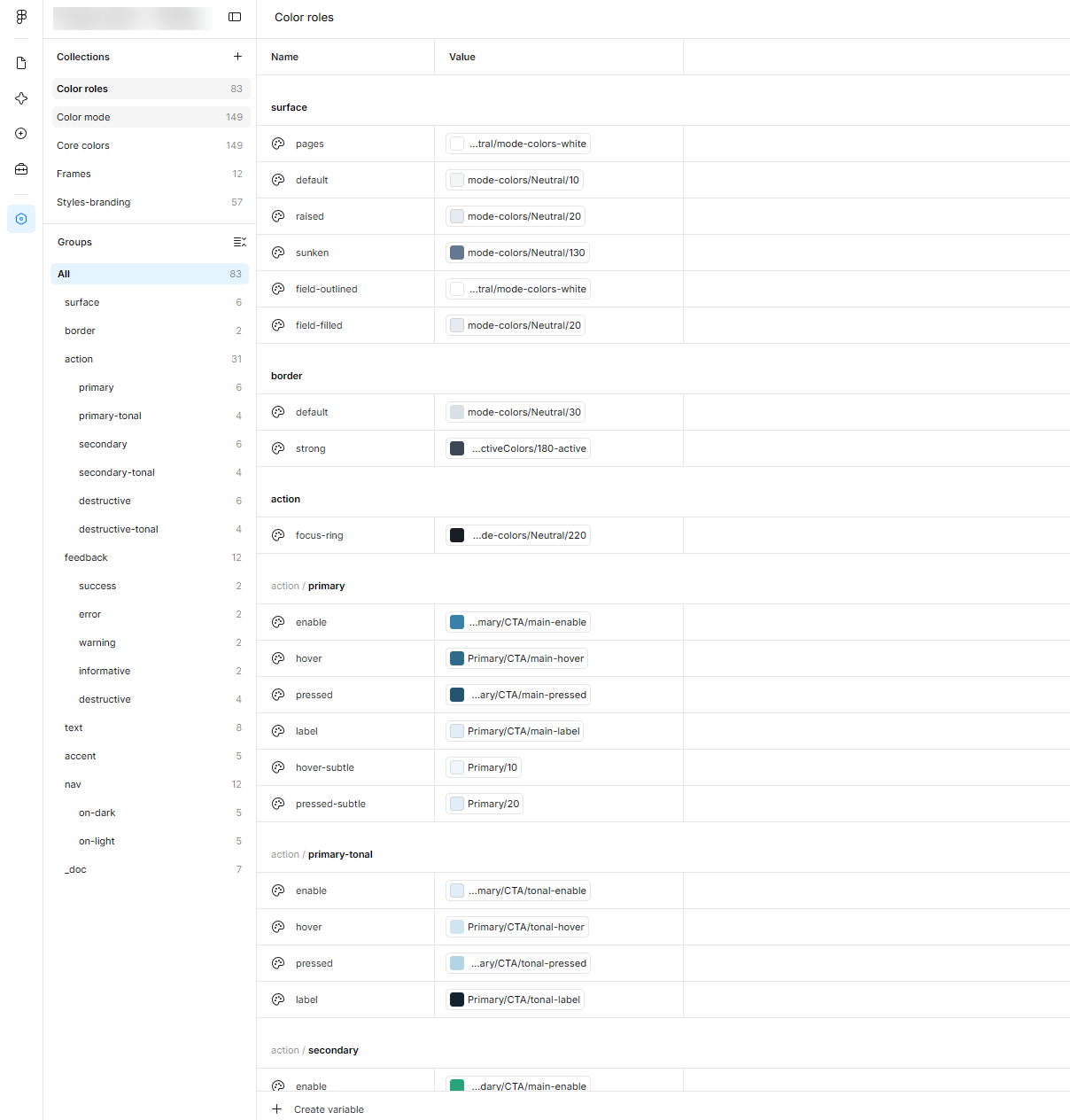
- A semantic colour architecture with three layers (primitives, mode colours, semantic roles), with a native dark mode requested by users, RGAA-compliant.
- No focus state existed on the client's software, and buttons had hover and pressed states but table cells and other components didn't: the interactive components were all rationalised on a consistent base (Enabled, Hover, Pressed, Focus, Disabled).
- More than 100 components and variants published and documented, with their variables and tokens.
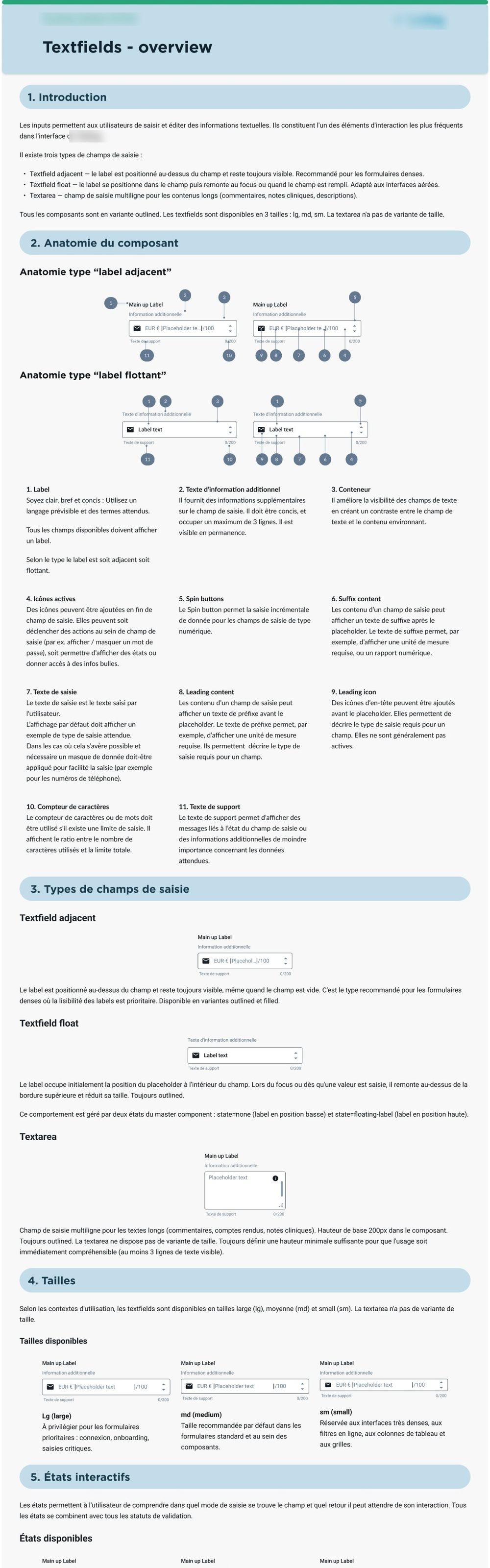
Documenting for two readers: human and machine.
(the consequence)04 · Results
100+
components and variants published and documented
3
semantic colour layers, light/dark mode included
RGAA
contrast checked and validated for every component
System validated in Figma, under study for implementation on the development side. The scope has widened: a mobile version is being scoped.
05 · Takeaways
ROI before aesthetics
A modest, defensible figure convinces better than a spectacular promise.
The profession before the convention
Business context takes priority over the generic convention of a design system.
Two readers, one system
Documenting for humans and machines makes it a truly implementable asset.